Imagine you’re a clothing boutique owner, and you observe a customer walk through the doors, spend 20 minutes glancing through the clothes on display, try a couple of them in the trial room, select five items, walk to the payment counter and then drop the idea of purchasing. She leaves your store empty-handed, and you sit there disappointed. This is exactly what happens in an online business when the user abandons a cart at checkout.
Checkout is the point at which the customer makes a payment. Any interruptions or friction at this junction can lead to drop-offs which lead to revenue loss. According to Dynamicyield, e-commerce brands lose up to $18 billion in revenue each year due to cart abandonment. A report by Baymard Institute that documented results from 46 different studies found that the average cart abandon rate across e-commerce is 69.82%.
With such huge implications, solving for checkout can be a win. Baymard Institute’s research uncovered that checkout optimisations could lead to a 35.62% increase in conversions.
What makes a bad checkout experience?
Lengthy forms: Lengthy forms can cause friction during checkout. “During testing, we consistently observe that users are overwhelmed and intimidated when seeing a high amount of form fields and selections,” the Baymard Institute explains. Here’s how UX performance decreases as the number of forms increases.
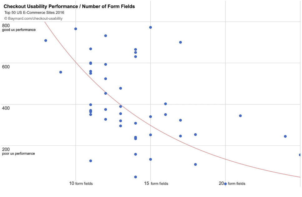
The more the number of form fields, the lower the usability performance. The study also found that the average number of steps in a checkout flow is 5.2, with 11.8 form fields (source: Baymard).
Similarly, when a new user is required to create an account to make a purchase, it leads to drop-offs. According to research, on average, e-commerce stores had 23.48 form elements and 14.88 form fields for new non-account customers! It’s no wonder why we see so many drop-offs!
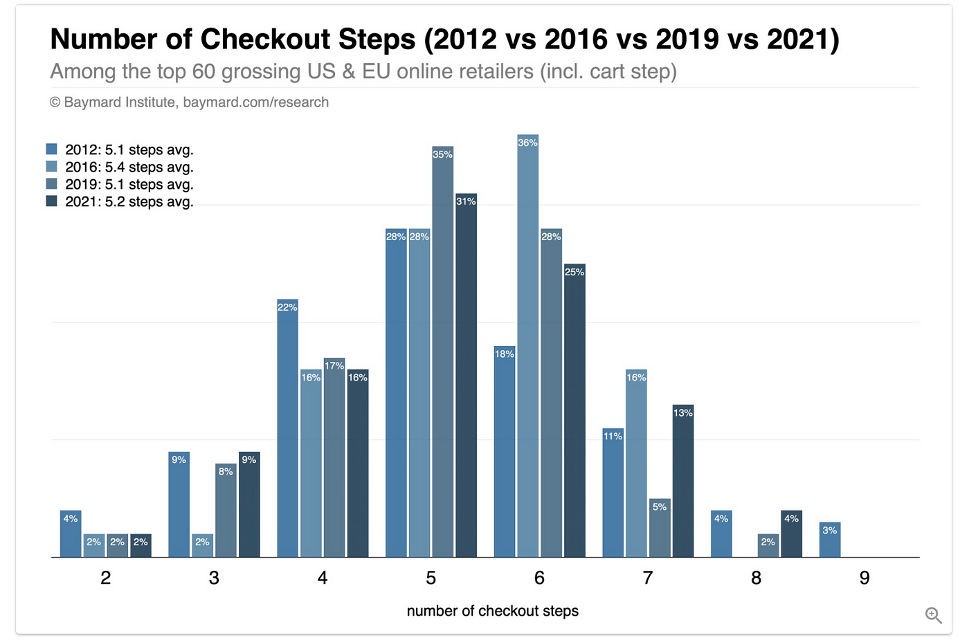
Limited payment options: Research has shown limited payment options as one of the reasons why customers abandon carts. Either they do not see the payment option of their choice, or their preferred payment option fails.
Device incompatibility: As we’ve noted, if the checkout experience is difficult, customers will drop off. Another major reason for a “difficult” checkout is incompatibility with the user’s device. An unresponsive checkout experience could include difficulty clicking CTAs, difficulty with scrolling, clicking errors on a zoomed-in screen etc.
Failed page loads: It’s frustrating when you’re about to place your order, you put in your card details and the OTP and then the page fails! This is a huge reason for customers to never make any purchases on your website again.
The Plural Checkout Solution
Plural Checkout is the right solution to solve for a bad checkout experience.
- It allows for checkout in just 2 clicks
- When you have a repeat customer, Plural Checkout auto-fills their net banking user ID within your app, further eliminating any friction
- It offers multiple payment options, including net banking, credit, and debit card, and Buy Now Pay Later (BNPL) options
- It offers cross compatibility with every platform
- It offers auto and manual reload when page load fails
Plural Checkout solves for multiple issues so your business can see a boost in conversions and consequently, a boost in revenue! Ready to opt for Plural Checkout? Write to us at pgsupport@pinelabs.com to get started.

Amrita Konaiagari is a Marketing Manager at Plural by Pine Labs and Editor of the Plural blog. She has over 10 years of marketing experience across Media & Tech industries and holds a Master’s degree in Communication and Journalism. She has a passion for home décor and is most definitely a dog person.

